Odd Bloom / Project story / 2026
Morrow
A global wallet.
A world of possibilities.
A website concept that makes money across borders feel approachable. Bold enough to invite exploration, with a clear structure that helps people understand the product.
- Project
- Self-initiated concept
- Focus
- Website & UI/UX design
- Formats
- Desktop & mobile
- Designed by
- Odd Bloom
01 / The brief
Make global money feel like everyday life.
The self-set brief was to design a website for a global wallet concept: a place to hold currencies, send money, get paid, and save. The challenge was to explain that breadth without overwhelming someone on their first visit.
Who it’s for
People whose lives cross borders: remote professionals, freelancers, and individuals managing money in more than one currency.
What the website needs to do
Introduce the wallet clearly, show its everyday uses, answer practical questions, and offer a focused next step through “Meet your new wallet.”
02 / The direction
Optimistic, with both feet on the ground.
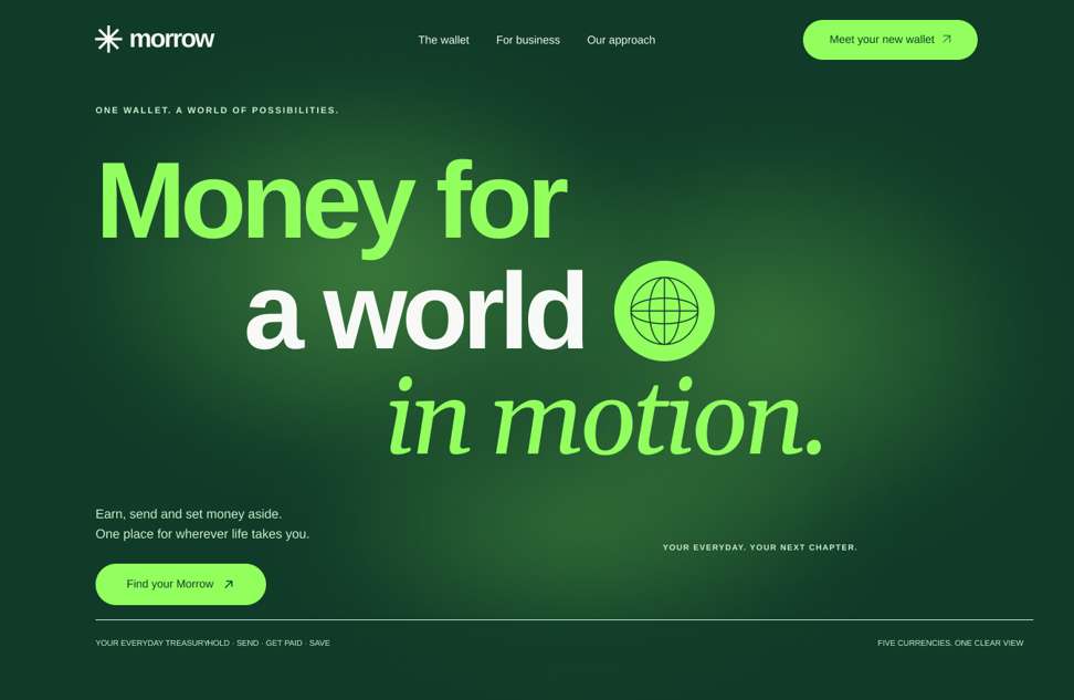
“A world in motion” became the organising idea. The visual language connects money with the lives it supports: work, travel, personal goals, and daily routines.
Oversized type gives the first screen confidence. Rounded forms soften the financial subject. Currency details and a globe make the international context immediate, while quieter sections leave room to read.
A bold opening, then a calmer rhythm
The hero establishes personality. The sections that follow shift toward practical information, so visual energy supports the story rather than competing with it.
One visual system across the journey
Repeated colours, rounded corners, consistent arrows, and shared spacing connect the wallet cards, feature sections, questions, and closing invitation.
03 / Colour palette
Fresh energy. A grounded foundation.
The palette pairs an expressive lime with deep green. That contrast gives Morrow a recognisable presence and creates a clear distinction between the main message, supporting content, and actions.
Deep green anchors the large surfaces. Lime draws attention to selected words and key actions. Soft white keeps longer explanations comfortable to read. Orange adds warmth to selected feature moments; ice and mint give supporting cards variety without breaking the family.
04 / Typography
Clarity with a little movement.
The type direction combines a direct, substantial sans serif with an expressive italic serif. Each has a distinct job: the sans serif establishes the message and handles interface information; the serif brings a human note to selected headline phrases.
The headline relationship
Money for a world
in motion.
Earn, send and set money aside.
One place for wherever life takes you.
Scale creates hierarchy. Large headlines carry the idea, medium headings introduce the features, and restrained body text explains them. The italic treatment stays selective so it remains meaningful. On mobile, the hierarchy is preserved while line lengths and spacing adapt to the smaller screen.
05 / The experience
Every section has a reason to be there.
Hero: establish the promise
The headline introduces a wallet for a mobile, international life. Supporting copy makes the proposition more concrete, and one primary invitation gives the screen a clear next step.
Global wallet: make the product tangible
Currency cards translate a broad promise into something people can recognise. Flags, currency names, and balances create a scan-friendly structure; decorative details remain secondary to those essentials.
Feature steps: explain one idea at a time
The numbered accordion organises several possibilities into smaller steps. The changing visual stays beside the open step, connecting explanation and example without asking readers to interpret everything at once.
Motion: guide attention
Gentle background movement adds atmosphere. Text reveals support the reading order. Motion is intended to remain subordinate to the message, with readable resting states and reduced-motion alternatives in a production build.
Questions: leave room for reassurance
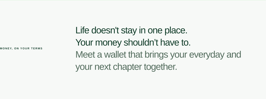
Expandable answers let visitors choose how much detail they need. Plain language and visible question labels support quick scanning before the final invitation.
Mobile: redesign the composition
The smaller layout uses stacked content, touch-friendly controls, and a full-page navigation menu. The goal is to retain the desktop personality while giving content enough room to work on a phone.
A final invitation, then a quiet landing.
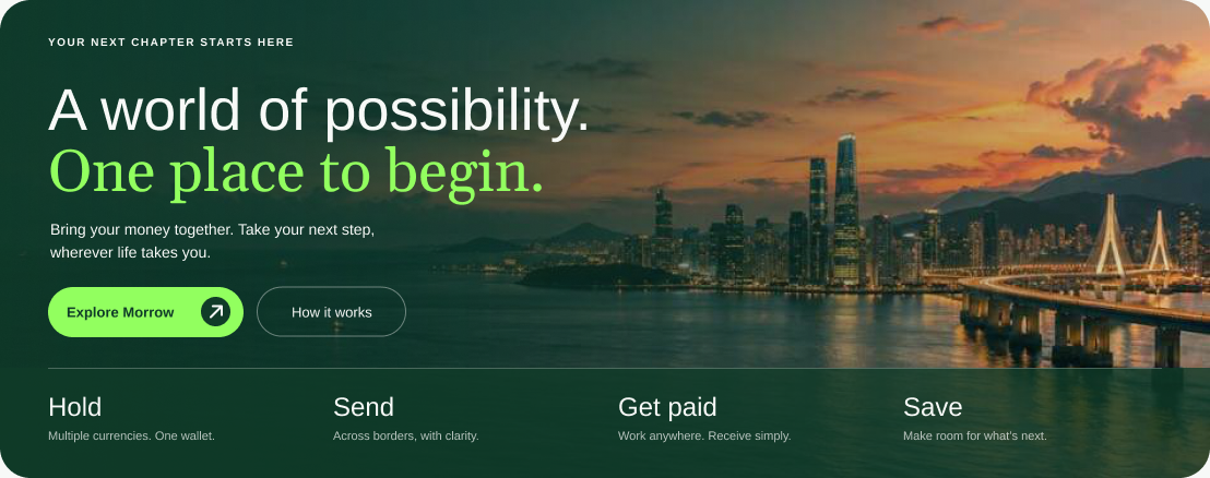
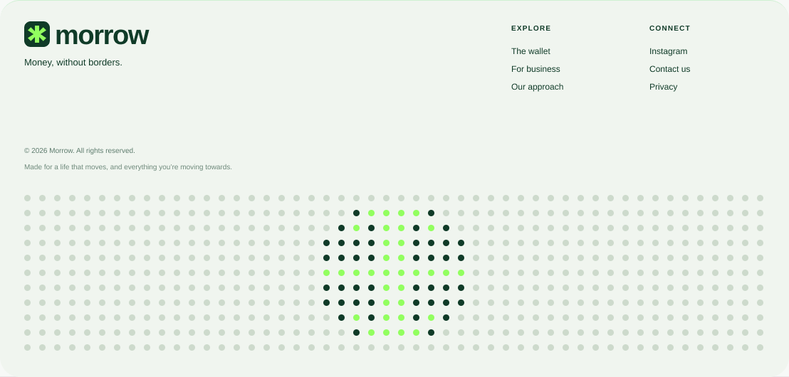
The closing CTA returns to the idea of possibility. Its city backdrop brings the global theme into a recognisable setting, while the footer uses the dotted brand symbol to finish the journey.
06 / Reflection
A clear point of view, ready to be tested.
Morrow explores how a financial website can feel expressive and approachable while keeping its structure practical. The result is a desktop and mobile design concept with a consistent visual language.
The next step would be to test comprehension, navigation, and the enquiry or onboarding journey with the intended audience, then refine the design around what people actually understand and need.
Morrow is a design exploration by Odd Bloom.
Your next chapter?
If this approach feels right for your brand, let’s start with a good conversation.